College Costs

I just read through an article in Investment News that shared some trends and averages for the cost of sending a child to college today and wanted to share.  Here are the highlights:

· According to the National Association of Independent Colleges and Universities, from 1998-2008, average private college year over year cost increases were 5.7% (many of you who have children may have heard me quote this “about 6% per year” number in the past).

· In 2009 and 2010, the average increase was 4.5%.

· In 2011, the average increase was 3.9% (thankfully the growth is slowing, but prices are still rising faster than the overall rate of inflation and the average middle-income earner’s cost-of-living adjustments at work).

· According to The College Board, the average tuition & fees for non-profit, private colleges and universities for the 2011-12 school year was $28,500. Add room and board and the total is $38,589 per year. The average amount a family pays after financial aid (grants and loans) is $12,970 per year, but given that most of that is Federally funded by Federally borrowed funds (e.g. the deficit/debt), counting on financial aid of this magnitude, especially in the form of grants, for the future is on par with counting on Social Security to be around in 20 years and continuing to operate the way it does today.

· For clients who have a goal of paying for all or part of college for their child(ren), we’re still using the ~6% annual increase in financial planning.  We think it’s easier to plan conservatively and be pleasantly surprised than to plan aggressively and come up short, though we’ll ratchet back the expectations somewhat if the annual cost increases continue to slow. For now, using 6%, a child born this year and starting school in 18 years would face a staggering four-year total tuition, fees, room, and board bill of $481,846.  Even using the 3.9% from last year, the total is $325,779 per child.

Save early and save often if you have a goal of paying for any substantial portion of that cost. In a future post, I’ll go through the best way to do that saving.
Housing Market Progress

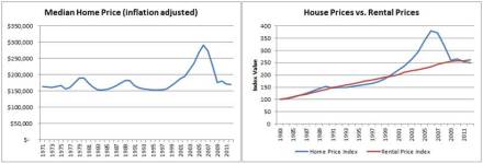
I wanted to quickly update two of the housing charts that I originally posted in the PWA Newsletter back in Q4 2009 (I’ve posted that article in the blog archives for reference). The first shoes the inflation-adjusted median price of a home in the U.S over time. The second shows a comparison of a national house price index (proxy for cost to buy) with a national rent index (proxy for cost to rent).

A few key takeaways (all from a national level of course):

1) House prices generally do not outpace inflation by very much on average. While there are repeated boom and bust cycles, and the 2000-today cycle is very fresh in memory, looking at the first chart above, you can see that on an inflation-adjusted basis (as measured by CPI), house prices have remained fairly steady over the past 40 years.

2) House prices, on average, are strongly correlated with rents.

3) The 2007-2012 bust in housing prices has not depressed the market as a whole to absurdly low levels. Real estate is not at a bargain price today as compared with rents or inflation-adjusted historical prices. Rather, the boom of 2001-2007 created prices that were absurdly high. These prices are now back to reasonable levels on a national level (local pockets of under/over valuation can obviously occur).

4) With mortgage rates at historical lows and prices at reasonable levels, affordability is near all-time highs. Buyers with a 20% downpayment and the median income level are able to afford a monthly payment that is very low as a proportion of their income, as measured by historical standards.

5) It’s tempting to say that prices are about as low as they can go, but it is a bit dangerous to make that assumption because:

a. If mortgage rates were at a more normal level by historical standards, buyers would be able to afford much less. What happens when rates eventually move back up?

b. The mortgage interest tax deduction is in question for the future. While we strongly doubt the deduction will be taken away in full, it is possible that it will be capped at a level much lower than the $1M of mortgage as it is today, and probable that the deduction for 2nd residences may be taken away completely. This would make the playing field between renting and buying much more equal, all other things being equal.

c. There is nothing to say that prices can’t overcompensate to the low side just like they did to the high side in 2001-2007.

6) Conclusion: no crystal ball, but the future of house prices looks considerably better than it did a few years ago.

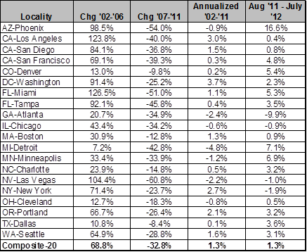
On a more local level, I did some slicing and dicing of the Case-Shiller home price index data. As you might expect, the localities that had the largest price increases in 2002-2006 had some of the sharpest falls in 2007-2011. I also included a column for change over the past year so you can tell what’s currently going on in your area (or an area near you). Sad story for the Atlantans who are reading this, but Phoenix, wow. Many cities definitely starting to see a (at least temporary) turnaround. Amazingly, the annualized increase in prices from 2002-2011 for the Composite of all 20 localities in the index (weighted by number of units) was still positive 1.3% per year even after the traumatic drops over the last few years. The last 12 months have shown an increase at that same 1.3% pace nationwide.